# 特效合集
# 按钮
# 立体按压
- 按压前有阴影
- 按压后阴影消失,体积缩小
体积缩小是关键效果,阴影可选
Copy
# 卡片
# 亮框提示
filter实现背景由暗变亮box-shadow实现亮框translate实现卡片上移
Copy
# 悬停显示内容
transition提供动画效果opacity height控制显隐
Hover cat
测试文档测试文档测试文档测试文档测试文档测试文档测试文档测试文档测试文档测试文档 测试文档测试文档测试文档测试文档测试文档测试文档测试文档测试文档测试文档测试文档 测试文档测试文档测试文档测试文档测试文档测试文档测试文档测试文档测试文档测试文档 测试文档测试文档测试文档测试文档测试文档测试文档测试文档测试文档测试文档测试文档 测试文档测试文档测试文档测试文档测试文档测试文档测试文档测试文档测试文档测试文档 测试文档测试文档测试文档测试文档测试文档测试文档测试文档测试文档测试文档测试文档 测试文档测试文档测试文档测试文档测试文档测试文档测试文档测试文档测试文档测试文档 测试文档测试文档测试文档测试文档测试文档测试文档测试文档测试文档测试文档测试文档 测试文档测试文档测试文档测试文档测试文档测试文档测试文档测试文档测试文档测试文档
Copy
# 标题
# 标题前置短竖线
- 用伪类
before为title添加一个前置子元素 - 子元素采用
inline-block布局,尺寸用em度量
用户数据
Copy
# 字体
# 字体阴影
依赖 text-shadow 实现阴影效果
字体阴影
Copy
# 氖光效果(Neon)
设置 3~n 层阴影效果,每一层的模糊半径(文字阴影的第三个参数)间隔较大,并且每一层的阴影颜色相同即可。
氖光效果 Neon
Copy
# 背景
# 电影海报
- 放大图片的一个部分
- 高斯模糊
- 黑色半透明蒙版
名侦探柯南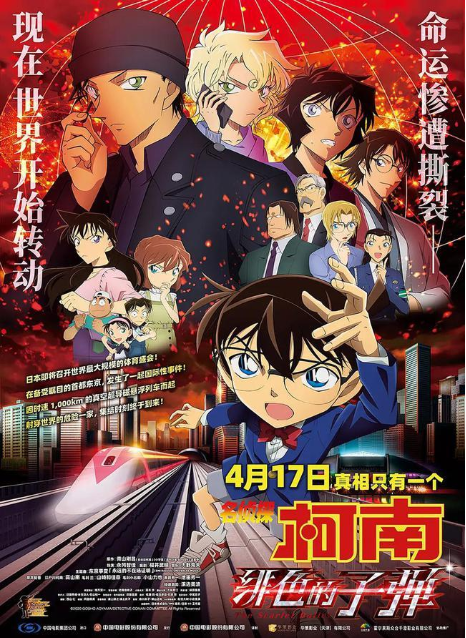
Copy
# 毛玻璃蒙版
- 两层图
- 底层完整清晰
- 顶层显示部分 高斯模糊
- 位移一致叠加成一张图
background:fixed
- 顶层再加上一层半透明蒙版
描述文字
Copy
# 边框
# 边框长度变化
- 利用
before after绘制左上和右下 hover时修改两个伪元素的高宽
Copy